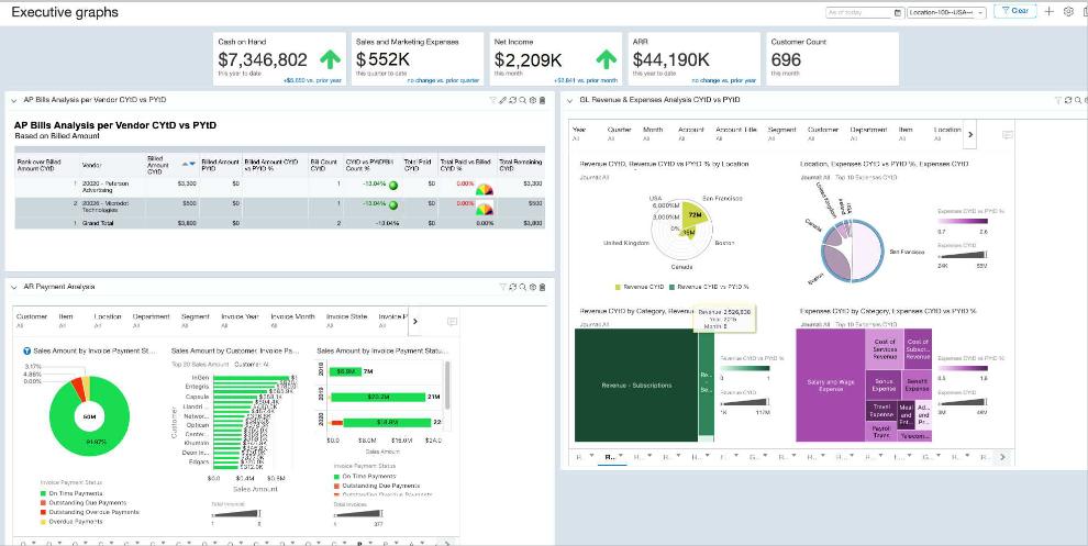
10 Essential Data Visualization Tools to Make Your Data Pop
Data visualization is a powerful way to communicate complex information in an easily digestible format. With the right tools, you can transform raw data into compelling visuals that highlight trends and insights. Here are 10 essential data visualization tools that can help make your data pop:
- Tableau: A leading data visualization tool that allows users to create interactive and shareable dashboards.
- Microsoft Power BI: Integrates seamlessly with Microsoft products and offers robust business intelligence capabilities.
- Qlik Sense: A self-service data visualization tool that empowers users to explore and visualize data.
- D3.js: A JavaScript library for producing dynamic, interactive data visualizations in web browsers.
- Plotly: Offers a range of graphing and visualization tools for data scientists and developers.
- Chart.js: A flexible JavaScript charting library for developers looking to create quick and responsive charts.
- Infogram: A user-friendly platform for creating stunning infographics and interactive data visualizations.
- Google Charts: Provides a simple way to create a variety of charts and embed them on web pages.
- Canva: Known for its graphic design capabilities, Canva also offers tools for creating visually appealing charts and infographics.
- Data Visualization Toolkit: A valuable resource for learning about various tools and best practices in data visualization.
Each of these data visualization tools comes equipped with its own unique features that cater to different types of users, whether you're a novice or an experienced data analyst. By leveraging these tools, you can enhance your reports, presentations, and even your website's analytics. Remember, effective data visualization is not just about aesthetics; it's about telling a story with your data that is both informative and engaging. Start experimenting with these tools today and watch your data come alive!
How to Choose the Right Data Visualization Tool for Your Needs
Choosing the right data visualization tool can significantly enhance your ability to communicate insights effectively. Start by evaluating your project requirements, including the complexity of your data and your desired outcome. For instance, if you need to visualize large datasets or require interactivity, consider tools like Tableau or Power BI. These platforms offer robust functionality for creating intricate visualizations, but may come with a steeper learning curve. Alternatively, if you're looking for simplicity and ease of use, web-based options like Canva may be more suitable.
Next, consider the integration capabilities of the tool you choose. It's essential to ensure that the data visualization tool can seamlessly connect with your existing data sources, whether it be SQL databases, spreadsheets, or cloud services. Additionally, think about collaboration features; if you're working in a team, tools such as Google Data Studio that allow for real-time collaboration can be invaluable. Lastly, don’t forget to explore pricing and support options, as these can also impact your overall experience and efficiency. To further guide your decision, check out resources from [G2](https://www.g2.com/categories/data-visualization) and [Capterra](https://www.capterra.com/data-visualization-software/) for in-depth reviews and comparisons.
5 Common Mistakes to Avoid When Using Data Visualization Tools
Data visualization tools are essential for turning complex data into understandable visuals, yet many users make critical mistakes that can undermine their efforts. One common mistake is overloading visuals with too much information, which can confuse rather than clarify. Instead, focus on simplicity by highlighting only the most relevant data points. As a general rule, keep your visuals clean and easy to interpret, allowing your audience to grasp the key insights without being overwhelmed. For more tips on maintaining clarity, check out this resource on Datawrapper.
Another frequent pitfall is the improper use of colors and scales in charts. Users often select colors that are difficult to distinguish or use misleading scales that skew the data interpretation. To avoid this, ensure that your color choices are accessible and used consistently across your visuals. Employing a color-blind friendly palette can greatly enhance the accessibility of your data. To learn more about effective color usage in data visualization, visit Visme.